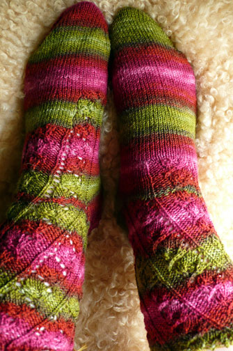
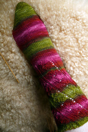
now i have two socks at the same point with slightly different pattern placement. the second sock is on the right; you saw the one on the left the other day.
i like them both a LOT, but i think i am going to go with the one on the left, with a few pattern modifications. i think i’ll start the lace pattern just a little higher on the foot, because everyone doesn’t have my size feet.
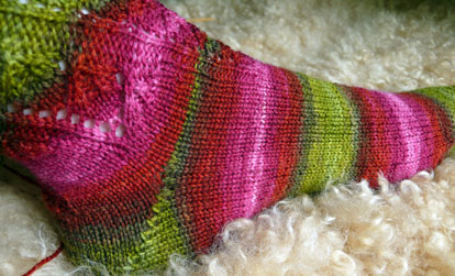
and i like the ankle area on sock #2, with the staggered patterns; they form a nice point at the ankle because of that.
and i love the back of the heel
with one motif alone trailing up and the the ones on each side coming later.
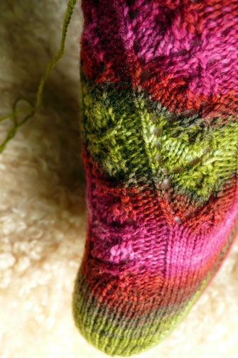
i stopped knitting sock #2 at a different point in the lace motif and the edge is not nearly as jaggedy-scalloped as sock one was in the last post.
that means i could add a little eyelet rib or something and it wouldn’t buckle in a funny way. it would make a nice ending i think, and he sewn bindoff would work well there.
so, i think i need to write up the pattern i now have in my head and knit a third sock from that.
i don’t have much else for you . . . this arrived today (in pretty bad condition) in my mailbox.
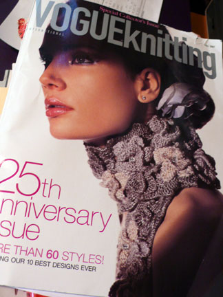
they decided to start using a MUCH thinner and less protective plastic wrapper just now, for their heaviest issue ever??
the issue is ok, and very full, but some of the photo stories make the garment details and stitches really hard to see. between the over-accessorizing and the strange lighting and photo editing, it begins to be a big departure from a knitting magazine.
don’t get me wrong—i have supported this magazine for years through its ups and downs for sure, and i’ve always believed that knitting needs a magazine that is largely about style and trends, as well as magazines that are more practical.
i’m just not a fan of confusion on the page, no matter what the topic, and i wish they would stick to trendy clothes and forget overly trendy photography.
and just one last . . . this, i cannot help. that BAG that pops up in all of their retrospective issues (p 134 in this new one) is really on its last legs and should NOT be resuscitated again. event the model looks pained to be wearing it.
it was sorta cute the very first time they ran it (1989), designed by marc jacobs for perry ellis, in feather-light mohair and shown over tights.
they have re-run it two other times that i can think of, less and less successfully. by now it has been redesigned to the point where it is but a shadow of its original self. the “design” doesn’t belong to anyone anymore and it sorta shows.
the thing is, this is JUST the kind of item that gives knitting a bad name, and is almost sure to disappoint the knitter, either by its weight, or the weight it adds to the body, or by the way it grows.
ok, rant over. i don’t really like to go there anyway. there has just been SO much more brilliance in that magazine over 25 years . . . we should be celebrating THAT.
25 thoughts on “two are better than one”
Both socks looks so lovely! I am sure your mods will just add the icing on the cake.
Never been a fan of Vogue. Too much “stuff” for my taste. I just can’t see buying a magazine if I don’t see myself ever knitting a single thing out of it. Oh well, if we all liked the same thing then life would be boring.
Personally, I just can’t get into vogue. We all want nice looking knits, but, IMHO, the “conformity” spirit of Vogue anything needs to stay away from my knitting.
Very cool socks!!! I love them!
Love the socks! Especially the left one – isn’t that the longER version? And I like the patterning starting somewhere on the foot like that where it will be seen more on those of us who almost always where slacks or jeans.
And you’re right, edgy, trendy designs are great – the same in the photography, not so much.
OH MY GOD!
I LOVE that you called it THAT BAG!
I was sitting here thinking “a purse?” but when you referenced 1989, I knew right away what you meant!
I was 24 then and working in a very expensive wool shop in Toronto. I can’t tell you how many makings I sold of that sweater – but I shuddered every single time. I even talked the owner out of making one as a sample. The damn thing sold itself.
We didn’t have the yarn called for in Canada then (Classic Elite?) so I was selling it in Anny Blatt mohair. Cost at least $400 to make. I wonder how many of those ended up at the Goodwill?
Thank you Anne, for making me laugh so hard I had to put my hand over my mouth as to not wake up DH (he’s working shifts!)
I am so glad I signed up for the October Sock Club. The socks look great. I love the color and the lace.
Gotta agree about Vogue. I’ve never been a fan of trendy, edgy knitting. Give me the classics with a few nods to current trends any day.
Love the new look of the blog. And it did load faster. Yeah! However, your blog is always well worth waiting for.
Funny – I saw only the picture of the two socks and said “One on the left!” then scrolled down and started reading…. 🙂
VK has been just too trendy for me lately – it does have it’s place, and there is usually one functional, wearable thing in each issue, but it has almost gone over the edge as far as readability goes. Looks very much like regular Vogue or some fashion mag – if that is what they are going for – good for them, but for a usable knitting pattern mag, not so much. Give me IK!
I think the one on the left is a good choice, too. Moving the pattern up (or down toward the toe) just a bit would make it perfect!
I like the longER one best. They’re both gorgeous, but something about the longER stripes just appeals to my inner sock goddess.
I’ve flipped through VK in stores before, but it’s never really appealed to me. To me it seemed too much like non-knitting Vogue: tiny models that never smile wearing stuff that us mortals could never afford. BUT I would be more than happy to have my mind changed.
Is there a picture of that bag somewhere? I checked the preview and it’s not there. Probably for a good reason.
I think the sock on the left would be perfect, especially if the lace pattern were to continue just a tad longer towards the toe. 🙂 About VK, I sat down and read it last night and after closing it realized that I had enjoyed the ads more than the editorial content (with the exception of the interview with ‘knitting’s old guard’ in which -and it may be my imagination- I could almost sense some tension). There *is* one little sweater (no.8 on p.127) that I quite like. 🙂
Lovely socks! Although I love the clean look of the stripes on the foot of the right sock, I still prefer the left one and adore the way the lace is growing on it and the heel, beautiful. I didn’t understand what do you want from the bag, stupid me,,, I am lucky I read the comments.
I like the socks. But my OCD self makes me think they’re twisted and need to be straightened out. Heh!
Now taking a much slower look at the socks the one on the left with the lace growing, makes me feel LESS OCD. Probably because of the non-symmetry.
I haven’t touched Vogue in years, with the exception of the sock issue last year… and even that one had mistakes in practically all the sock patterns (and a retread of the Traveler’s Stockings by Nancy Bush, which had already been published in IK and in Nancy’s own book… so why drag it out *again*?)
But I’m so looking forward to Eunny’s first issue of IK! The preview has a few obvious clunkers in it, but overall it looks like something to get genuinely excited about. 🙂
I agree with you on Vogue- I stopped buying it. Every issue arrived very beat up too. Chocked full of meh things in it and sooo many ads. Unfortunately IK has started doing sort of the same thing- ads on every right side page and their layout change in the spring just doesn’t do it for me. I will still subscribe to them though in hopes someone come to their senses on the IK layout.
I like VK for it’s imagination and fashion sense. But as a larger woman it’s mostly useless as a pattern book. It may be slowly changin a little… The last couple of issues had a few things in my size range. But only a few years ago they had none.
I’m just not at the point in my knitting knowledge where I can refigure a pattern to my size yet.
Socks look great! Love the colour. Will have to keep an eye on the KAL. food from previous post looks good, yum, yum. As for vogue been prett disappointed in the magazine of late.
Both socks are beauties, I don’t know how you every make any design decisions at all. I’d be looking at them for a month trying to figure out which color repeat, and heel stitch, and if I liked where the lace stitch started on the foot best. And then when I think I had it all figured out I’d realize some other little reason why I liked something else better about this other little aspect of that in this, LOL! Btw, I haven’t seen the new Vogue so I have no opinion. But I will say I’ve never been a big fan.
I like left too, with the lace sort of growing out of the stripes.
Just got my VK today and, OK, I’m really not much of a fashionista. But, that sweater, 26(!) balls of LaGran, is nearly two and a half pounds of mohair. No.
Anne, I respectfully wish to offer some constructive criticism. I find the way that the lace pattern ends on the foot to be rather abrupt. I love the heel, and the twisty lace. The staggered version appeals to me. I wonder if it the eyelets were continued down the side, could they be made to frame the lace?
It’s just a preference of mine, to have one thing flow into the other.
oh, i like those socks – especially the staggered one!
The socks are beautiful!
The sock design is looking great!
I was actually glad to read your semi-rant about Vogue Knitting (not much a “rant” by the way :). I finally gave in to my growing disappointment with the magazine and stopped my subscription recently. This is the first (perhaps second?) issue I’ve missed and I was beginning to miss the fun of opening the mailbox to find the latest issue, but you reminded me of the reason I stopped the subscription. Not only the issues you mention, but more generally – I’m just not fashionable enough and certainly not trendy 🙂
My VK came yesterday, and the only new item that I would even consider making was the cover scarf. Perhaps current fashion trends are to blame. I love the original “bag”, and a lot of the old patterns that VK attempted to “update”. Fortunately I have the old magazines, in case I want to knit any of the originals.
My personal pet peeve with all of the major knitting magazines right now is the tiny type that they use for articles. Because the articles themselves are often very thin on content, it’s just too much work to try to read them.
Comments are closed.